Visualizing Dot-Whisker Regression Coefficients in Python
Today I spent some time to work out better visualizations for a manuscript in Python using Matplotlib. I figured I should write it down because there are really very few resource on this!
import pandas as pd
import statsmodels.formula.api as smf
from matplotlib import pyplot as plt
from matplotlib.lines import Line2D
%matplotlib inline
In the past year, I’ve been using R for regression analysis. This is mainly because there are great packages for visualizing regression coefficients:
However, I hardly found any useful counterparts in Python. The closest I got from Google is from statsmodels, but it is not very good. The other one I found is related to this StackOverflow question, which used seaborn’s coefplot, which has already been deprecated and not usable.
Therefore, I decided to try using matplotlib to build my own dot-and-whisker plots that can be used for journal publications.
Data preparation
Let’s play with the swiss dataset.
url = "https://raw.githubusercontent.com/vincentarelbundock/Rdatasets/master/csv/datasets/swiss.csv"
df = pd.read_csv(url, index_col=0)
df.head()
| Fertility | Agriculture | Examination | Education | Catholic | Infant.Mortality | |
|---|---|---|---|---|---|---|
| Courtelary | 80.2 | 17.0 | 15 | 12 | 9.96 | 22.2 |
| Delemont | 83.1 | 45.1 | 6 | 9 | 84.84 | 22.2 |
| Franches-Mnt | 92.5 | 39.7 | 5 | 5 | 93.40 | 20.2 |
| Moutier | 85.8 | 36.5 | 12 | 7 | 33.77 | 20.3 |
| Neuveville | 76.9 | 43.5 | 17 | 15 | 5.16 | 20.6 |
Change column names for convenience.
df.columns = ['fertility', 'agri', 'exam', 'edu', 'catholic', 'infant_mort']
Now, let’s build a simple regression model.
formula = 'fertility ~ %s'%(" + ".join(df.columns.values[1:]))
formula
'fertility ~ agri + exam + edu + catholic + infant_mort'
lin_reg = smf.ols(formula, data=df).fit()
lin_reg.summary()
| Dep. Variable: | fertility | R-squared: | 0.707 |
|---|---|---|---|
| Model: | OLS | Adj. R-squared: | 0.671 |
| Method: | Least Squares | F-statistic: | 19.76 |
| Date: | Thu, 22 Feb 2018 | Prob (F-statistic): | 5.59e-10 |
| Time: | 20:56:58 | Log-Likelihood: | -156.04 |
| No. Observations: | 47 | AIC: | 324.1 |
| Df Residuals: | 41 | BIC: | 335.2 |
| Df Model: | 5 | ||
| Covariance Type: | nonrobust |
| coef | std err | t | P>|t| | [0.025 | 0.975] | |
|---|---|---|---|---|---|---|
| Intercept | 66.9152 | 10.706 | 6.250 | 0.000 | 45.294 | 88.536 |
| agri | -0.1721 | 0.070 | -2.448 | 0.019 | -0.314 | -0.030 |
| exam | -0.2580 | 0.254 | -1.016 | 0.315 | -0.771 | 0.255 |
| edu | -0.8709 | 0.183 | -4.758 | 0.000 | -1.241 | -0.501 |
| catholic | 0.1041 | 0.035 | 2.953 | 0.005 | 0.033 | 0.175 |
| infant_mort | 1.0770 | 0.382 | 2.822 | 0.007 | 0.306 | 1.848 |
| Omnibus: | 0.058 | Durbin-Watson: | 1.454 |
|---|---|---|---|
| Prob(Omnibus): | 0.971 | Jarque-Bera (JB): | 0.155 |
| Skew: | -0.077 | Prob(JB): | 0.925 |
| Kurtosis: | 2.764 | Cond. No. | 807. |
Now that we obtained the result, we need three things for building the coefficient plot:
- Point estimates (
coef) - Confidence intervals (
[0.025, 0.975]) - Covariate names (of course
 )
)
lin_reg.params
Intercept      66.915182
agri           -0.172114
exam           -0.258008
edu            -0.870940
catholic        0.104115
infant_mort     1.077048
dtype: float64
lin_reg.conf_int()
| 0 | 1 | |
|---|---|---|
| Intercept | 45.293900 | 88.536463 |
| agri | -0.314096 | -0.030132 |
| exam | -0.770726 | 0.254709 |
| edu | -1.240574 | -0.501306 |
| catholic | 0.032911 | 0.175320 |
| infant_mort | 0.306150 | 1.847947 |
Calcualte the error bar lengths for confidence intervals.
err_series = lin_reg.params - lin_reg.conf_int()[0]
err_series
Intercept      21.621281
agri            0.141982
exam            0.512717
edu             0.369634
catholic        0.071205
infant_mort     0.770898
dtype: float64
Typically, we do not care about intercepts.
coef_df = pd.DataFrame({'coef': lin_reg.params.values[1:],
                        'err': err_series.values[1:],
                        'varname': err_series.index.values[1:]
                       })
coef_df
| coef | err | varname | |
|---|---|---|---|
| 0 | -0.172114 | 0.141982 | agri |
| 1 | -0.258008 | 0.512717 | exam |
| 2 | -0.870940 | 0.369634 | edu |
| 3 | 0.104115 | 0.071205 | catholic |
| 4 | 1.077048 | 0.770898 | infant_mort |
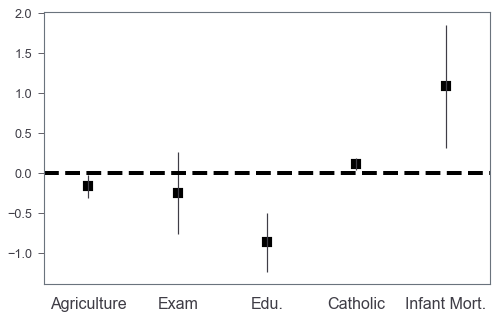
Let’s plot!
Basic coefplot
The basic idea is that we plot a bar chart without facecolors, and then we can add scatter plots to annotate the coefficients values by markers.
fig, ax = plt.subplots(figsize=(8, 5))
coef_df.plot(x='varname', y='coef', kind='bar',
             ax=ax, color='none',
             yerr='err', legend=False)
ax.set_ylabel('')
ax.set_xlabel('')
ax.scatter(x=pd.np.arange(coef_df.shape[0]),
           marker='s', s=120,
           y=coef_df['coef'], color='black')
ax.axhline(y=0, linestyle='--', color='black', linewidth=4)
ax.xaxis.set_ticks_position('none')
_ = ax.set_xticklabels(['Agriculture', 'Exam', 'Edu.', 'Catholic', 'Infant Mort.'],
                       rotation=0, fontsize=16)
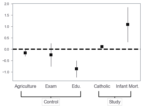
Control/study variables?
Sometimes we may want to annotate which are control variables and which are study variables. We use use Axes.annotate to highlight them! Let’s say we want to highlight the last two as study variables.
The answer to this StackOverflow question helps me a lot. Credit to the author!
fig, ax = plt.subplots(figsize=(8, 5))
coef_df.plot(x='varname', y='coef', kind='bar',
             ax=ax, color='none',
             yerr='err', legend=False)
ax.set_ylabel('')
ax.set_xlabel('')
ax.scatter(x=pd.np.arange(coef_df.shape[0]),
           marker='s', s=120,
           y=coef_df['coef'], color='black')
ax.axhline(y=0, linestyle='--', color='black', linewidth=4)
ax.xaxis.set_ticks_position('none')
_ = ax.set_xticklabels(['Agriculture', 'Exam', 'Edu.', 'Catholic', 'Infant Mort.'],
                       rotation=0, fontsize=16)

fs = 16
ax.annotate('Control', xy=(0.3, -0.2), xytext=(0.3, -0.3),
            xycoords='axes fraction',
            textcoords='axes fraction',
            fontsize=fs, ha='center', va='bottom',
            bbox=dict(boxstyle='square', fc='white', ec='black'),
            arrowprops=dict(arrowstyle='-[, widthB=6.5, lengthB=1.2', lw=2.0, color='black'))

_ = ax.annotate('Study', xy=(0.8, -0.2), xytext=(0.8, -0.3),
                 xycoords='axes fraction',
                 textcoords='axes fraction',
                 fontsize=fs, ha='center', va='bottom',
                 bbox=dict(boxstyle='square', fc='white', ec='black'),
                 arrowprops=dict(arrowstyle='-[, widthB=3.5, lengthB=1.2', lw=2.0, color='black'))
Multiple models
It’s also very easy to generalize this barchart to incorporate multiple models’ results by shifting barchart’s X axis positions.
let’s say we have two models:
- Three controls plus Catholic
- Three controls plus Infant Mort.
Collect coefficients
formula_1 = 'fertility ~ %s'%(" + ".join(df.columns.values[1:-1]))
print(formula_1)
mod_1 = smf.ols(formula_1, data=df).fit()
mod_1.params
fertility ~ agri + exam + edu + catholic

Intercept    91.055424
agri         -0.220646
exam         -0.260582
edu          -0.961612
catholic      0.124418
dtype: float64
formula_2 = 'fertility ~ %s'%(" + ".join(df.columns.values[1:-2].tolist() + ['infant_mort']))
print(formula_2)
mod_2 = smf.ols(formula_2, data=df).fit()
mod_2.params
fertility ~ agri + exam + edu + infant_mort

Intercept      68.773136
agri           -0.129292
exam           -0.687994
edu            -0.619649
infant_mort     1.307097
dtype: float64
coef_df = pd.DataFrame()
for i, mod in enumerate([mod_1, mod_2]):
    err_series = mod.params - mod.conf_int()[0]
    coef_df = coef_df.append(pd.DataFrame({'coef': mod.params.values[1:],
                                           'err': err_series.values[1:],
                                           'varname': err_series.index.values[1:],
                                           'model': 'model %d'%(i+1)
                                          })
                            )
coef_df
| coef | err | model | varname | |
|---|---|---|---|---|
| 0 | -0.220646 | 0.148531 | model 1 | agri |
| 1 | -0.260582 | 0.553176 | model 1 | exam |
| 2 | -0.961612 | 0.392609 | model 1 | edu |
| 3 | 0.124418 | 0.075207 | model 1 | catholic |
| 0 | -0.129292 | 0.151049 | model 2 | agri |
| 1 | -0.687994 | 0.456646 | model 2 | exam |
| 2 | -0.619649 | 0.355803 | model 2 | edu |
| 3 | 1.307097 | 0.820514 | model 2 | infant_mort |
Plot!
## marker to use
marker_list = 'so'
width=0.25
## 5 covariates in total
base_x = pd.np.arange(5) - 0.2
base_x
array([-0.2, 0.8, 1.8, 2.8, 3.8])
fig, ax = plt.subplots(figsize=(8, 5))
for i, mod in enumerate(coef_df.model.unique()):
    mod_df = coef_df[coef_df.model == mod]
    mod_df = mod_df.set_index('varname').reindex(coef_df['varname'].unique())
    ## offset x posistions
    X = base_x + width*i
    ax.bar(X, mod_df['coef'],
           color='none',yerr=mod_df['err'])
    ## remove axis labels
    ax.set_ylabel('')
    ax.set_xlabel('')
    ax.scatter(x=X,
               marker=marker_list[i], s=120,
               y=mod_df['coef'], color='black')
    ax.axhline(y=0, linestyle='--', color='black', linewidth=4)
    ax.xaxis.set_ticks_position('none')
    _ = ax.set_xticklabels(['', 'Agriculture', 'Exam', 'Edu.', 'Catholic', 'Infant Mort.'],
                           rotation=0, fontsize=16)

    fs = 16
    ax.annotate('Control', xy=(0.3, -0.2), xytext=(0.3, -0.35),
                xycoords='axes fraction',
                textcoords='axes fraction',
                fontsize=fs, ha='center', va='bottom',
                bbox=dict(boxstyle='square', fc='white', ec='black'),
                arrowprops=dict(arrowstyle='-[, widthB=6.5, lengthB=1.2', lw=2.0, color='black'))

    ax.annotate('Study', xy=(0.8, -0.2), xytext=(0.8, -0.35),
                xycoords='axes fraction',
                textcoords='axes fraction',
                fontsize=fs, ha='center', va='bottom',
                bbox=dict(boxstyle='square', fc='white', ec='black'),
                arrowprops=dict(arrowstyle='-[, widthB=3.5, lengthB=1.2', lw=2.0, color='black'))

## finally, build customized legend
legend_elements = [Line2D([0], [0], marker=m,
                          label='Model %d'%i,
                          color = 'k',
                          markersize=10)
                   for i, m in enumerate(marker_list)
                  ]
_ = ax.legend(handles=legend_elements, loc=2,
              prop={'size': 15}, labelspacing=1.2)
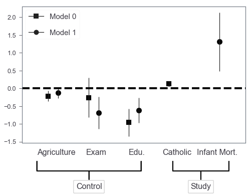
Finally, we got something that’s very similar to those produced by R packages! Further, we can easily extend this to the situation where we need subplots to include more models. I was thinking of getting a wrapper around this in case I need this in the future. However, the adjustments of annotate’s coordinates and arrowprops properties seem to be not that trivial to me…

Zhiya Zuo
Filet-O-Fish 🍔 is the BEST!